Ekstra style dla menu - MENU CSS EFEKTY#2
01/04/2022 17:08:23
Komentarze
0
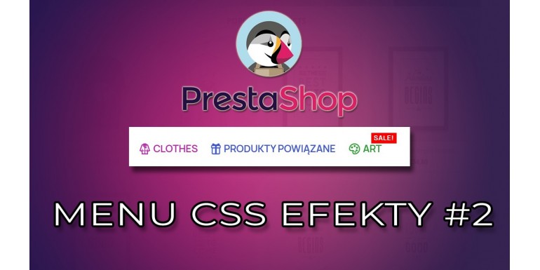
Jest to druga odsłona jak nadać niecodzienny wygląd naszemu menu, teraz pobawimy się kolorami oraz dodamy ikony, oraz kilka innych efektów
/* shine */


#header .top-menu li a[data-depth="0"]:hover {
    background: linear-gradient(to right, #4d4d4d 0, white 10%, #4d4d4d 20%);
    background-position: 0;
    -webkit-background-clip: text;
    -webkit-text-fill-color: transparent;
    animation: shine 2s infinite linear;
    animation-fill-mode: forwards;
}

@keyframes shine {
    0% {
        background-position: 0;
    }
    100% {
        background-position: 180px;
    }
}
/* podkreslenie */


#header .top-menu li a[data-depth="0"] {
    background-position: bottom left;
    background-size: 0% 5px;
    background-image: linear-gradient(#6666f6, #1915cc);
    background-repeat: no-repeat;
    padding-bottom: 5px;
    transition: all 500ms ease-in-out;
   }

   #header .top-menu li a[data-depth="0"]:hover {
    background-size: 100% 5px;
   }
/* podkreslenie i tło */


#header .top-menu li a[data-depth="0"] {
    position: relative;
    z-index:9;
}
#header .top-menu li a[data-depth="0"]::after {
   position:absolute;
   content:'';
   width: 0px;
   height: 0px;
   background: #e0e0e0;
   bottom: 0;
   left:0;
   transition: all .5s;
}

#header .top-menu li a[data-depth="0"]:hover::after {
   width: 100%;
   height: 3px;
}

#header .top-menu li a[data-depth="0"]::before {
   position:absolute;
   content:'';
   width: 100%;
   height: 0;
   left:0;
   background: #e0e0e0;
   bottom: 0;
   transition: all .5s;
   transition-delay: .5s;
   z-index: 1;

}

#header .top-menu li a[data-depth="0"]:hover::before {
   height: 100%;
   z-index: -1;
}


Zostaw komentarz Anuluj komentarz